Went well (I think)
slides of powerpoint will follow soon
Friday, 26 November 2010
Thursday, 4 November 2010
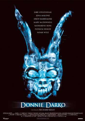
Cover Analysis - Donnie Darko
The first thing you are drawn to is the ball of light coming out of Donnie's chest. unless you have seen the film before, this won't make sence, suggesting mystery - a key connotation to the thriller genre. this light serves another purpose - it illuminates his face and shows his expression.
His expression is blank, but with the faint hint of a smile. The blankness suggests a lack of control, but the smile says that he is enjoying himself. It is almost a smug look. Could he be the villain? You also cannot see what he is looking at, but he clearly has focus. Purpose. Again, this suggests that our main character is not necessarily the 'good guy'. This, however, is just an idea fomulated by the viewer to draw them away from figuring out what is happening too quickly. This is known as a 'red herring'. This is a key theme to the genre.
The outside of the cover is in shadow, and it appears to be creeping up on the character. Wether this is portrayed to be interpreted litterally or metaphorically, it still re-enforces the underlying tone of darkness. This also links back to the character's moral standing, which I believe to be useful as it adds more mystery and a negative tone. This is foreshadowing a negative ending to the plot, but you are not shown exactly what is is (obviously, becuse that would ruin it...). The axe he carries so casually across one shoulder further adds to the dark theme, as does the background - this is also dark, suggesting night or dusk (the recession of light).
Lastly, the cover also shows text, most likely from 'Grandma Death's' book. To someone who has seen the film, this adds context and depth as it is part of the film. Also, it has a 'spooky' or mysterious appearance. It seems as though he is being analysed. This analytical approach questions the character and further re-enforces the idea of mystery, or something abnormal, adding to the thriller theme.
To conclude, throught colour, lighting and objects (such as the axe) themed to the film, a dark atmosphere and an heir of mystery is created. The ovetall theme of the film i sumned up well in this cover.

Subscribe to:
Comments (Atom)